Hello!
As promised, I'm back with a calligraphy based card. It's not super fancy calligraphy, although I often find that the 'simpler' alphabets are the most difficult to master because any slight mistake throws the whole thing out, not to mention that it stick out like a sore thumb!
This card uses a font that I haven't tried before, but I think I'm hooked!
My card is for a dear friend who is feeling a bit down in the dumps after an unexpected break up. I found this Shakespeare quote and thought it would be ideal for the situation! I love Shakespeare...the guy was a genius!!
This alphabet is a mixture of 'fat' and 'thin'!! I used the 'fat' letters for the beginning of each word, and 'thin' lettering for the rest. I like the contrast, especially in the second line where each word begins and ends with the same letter however one is 'fat' and one is 'thin' :) I edged each letter along the right hand side with silver ink and then blended the Distress Ink colours over the top. The colour helps the highlights show up which is good as that was the idea!! I couldn't decide whether to go red and orange or blue and green, but I chose the warmer colours for this occasion :)
Here's a close up..
I hope you can see it ok?! The silver highlights and the matt silver mat (hmm, that sounds weird?!) are much more effective in the flesh...not so much in the picture! I also hope my friend likes it and it goes some way towards making her feel a bit better :)
Thanks for stopping by ;)
Supplies
Card: Paper Mill Direct - White, Black; Create & Craft - Matt Silver card; Handmade paper from stash
Stamps: None!!!
Ink: Windsor & Newton - Black; Manuscript - Silver; Distress Ink - Barn Door, Wild Honey
Other: None
Wednesday, 12 February 2014
Tuesday, 11 February 2014
...oops, I'm a bit late for the party!...
Hi guys!
How are you all? I know it seems like I haven't been around for a while, but I have. I have been trying to find time to make cards, which hasn't been too much of a problem except for Mr Mojo having gone on the missing list again; the trouble has been finding the time once my cards have been made to photograph and upload them! This is in no small part due to the fact that my mojo has taken a nose dive and therefore the time normally allotted to making, photographing, editing and posting is now being taken up by procrastinating, procrastinating, making, procrastinating some more and then finishing a card. This leaves no time for the getting my cards from my desk onto the world wide interweb to share with you lovely people! I think in some cases this has been a blessing however!! :)
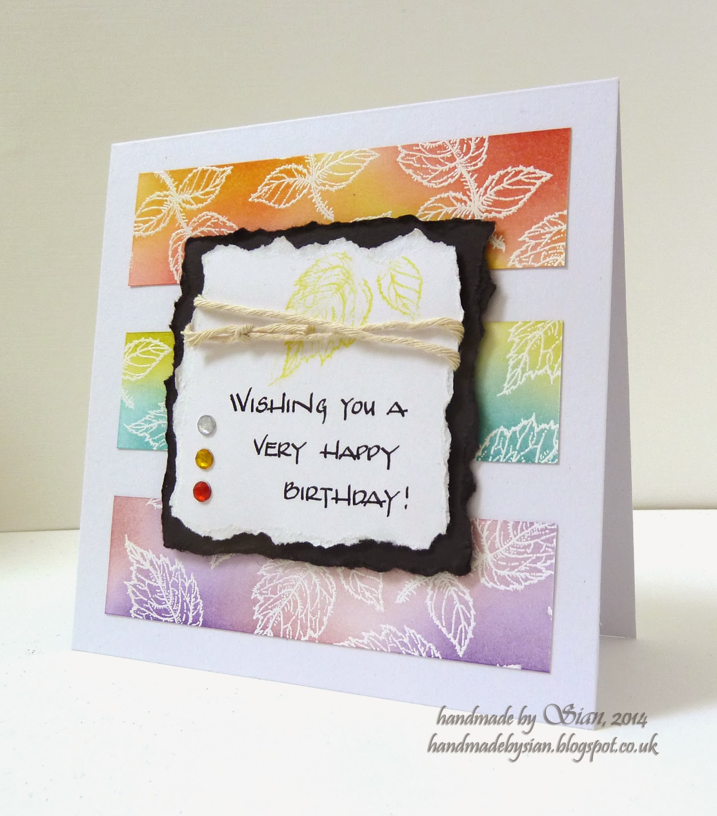
One such case was this card I made for Retro Sketches 100th sketch. It was a cool sketch and I wanted to participate in the celebration of reaching 100 challenges, that's no mean feat! My card was completed well within the deadline but, alas, it did not make it into my camera and onto my computer in time :( I thought I'd share it anyway though because Darnell tells me off if I don't!! :)
and here's the sketch...
I'm not sure how I feel about this card yet...sometimes I think it looks lovely and bright and sometimes I'm sure there's something wrong with it?! There were some seriously awesome entries for this challenge so it's not like I was a contender, I just wanted to join in :) I did a bit of Distress Ink blending over the white embossed leaves - I love a bit of emboss resist :) Again, there's a bit of calligraphy here, I can feel myself getting back into it and not being so lazy with it!! I have another calligraphy based card coming tomorrow, so watch this space!! ;)
Thanks for stopping by to see my card that didn't quite make it! Love you all :)
Supplies
Card: Paper Mill Direct - White, Black
Stamps: Flourishes - Berry Sweet
Ink: Ranger - Perfect Medium; Distress Ink - Barn Door, Spiced Marmalade, Wild Honey, Broken
China, Crushed Olive, Victorian Velvet, Dusty Concord; Papermania - Yellow
Other: WOW! - Bright White Opaque e/p; twine, rhinestones
How are you all? I know it seems like I haven't been around for a while, but I have. I have been trying to find time to make cards, which hasn't been too much of a problem except for Mr Mojo having gone on the missing list again; the trouble has been finding the time once my cards have been made to photograph and upload them! This is in no small part due to the fact that my mojo has taken a nose dive and therefore the time normally allotted to making, photographing, editing and posting is now being taken up by procrastinating, procrastinating, making, procrastinating some more and then finishing a card. This leaves no time for the getting my cards from my desk onto the world wide interweb to share with you lovely people! I think in some cases this has been a blessing however!! :)
One such case was this card I made for Retro Sketches 100th sketch. It was a cool sketch and I wanted to participate in the celebration of reaching 100 challenges, that's no mean feat! My card was completed well within the deadline but, alas, it did not make it into my camera and onto my computer in time :( I thought I'd share it anyway though because Darnell tells me off if I don't!! :)
and here's the sketch...
I'm not sure how I feel about this card yet...sometimes I think it looks lovely and bright and sometimes I'm sure there's something wrong with it?! There were some seriously awesome entries for this challenge so it's not like I was a contender, I just wanted to join in :) I did a bit of Distress Ink blending over the white embossed leaves - I love a bit of emboss resist :) Again, there's a bit of calligraphy here, I can feel myself getting back into it and not being so lazy with it!! I have another calligraphy based card coming tomorrow, so watch this space!! ;)
Thanks for stopping by to see my card that didn't quite make it! Love you all :)
Supplies
Card: Paper Mill Direct - White, Black
Stamps: Flourishes - Berry Sweet
Ink: Ranger - Perfect Medium; Distress Ink - Barn Door, Spiced Marmalade, Wild Honey, Broken
China, Crushed Olive, Victorian Velvet, Dusty Concord; Papermania - Yellow
Other: WOW! - Bright White Opaque e/p; twine, rhinestones
Monday, 3 February 2014
Love, love, love...
Hello, hello!
How are you all? I hope you all had a fabulous weekend and got a chance to get some crafting in :)
Well, all has returned to normal here. We are both home, myself from visiting family and DOH from sunny Australia. Bless him, at the wedding he got heat stroke and nearly passed out! He was fine after a while though and by all accounts was well looked after by his nearest and dearest in my absence :) He had a fantastic time and I know he wished he could've stayed longer, but that's life I suppose. We're planning a trip over there, hopefully this year, to spend some quality time with his family :)
But now, it's that time of year again when I wish I'd bought a heart die!! Every year I think, 'this would be easier if I had a heart die, I'll make sure I get one of those' and yet here we are, another year has passed still with no die! Stars, that's another die set on my list...maybe one day I'll get round to it ;)
I have made two cards today (the withdrawal of being away from my desk has put me into overdrive!) both of which are for Valentines Day :) This first one is for my DOH and is for THREE challenges! It's rare that I make a card that is eligible for that many challenges!
This idea has been floating around my head for a little while now...I'm not entirely sure where it came from?! I also wasn't sure how I was going to make it into a reality so I just went with it and here's how it ended up! It really doesn't require an explanation so I'll not bore you! The only thing I will say is that yes, the sentiment is handwritten :) I haven't used the Gothic style font for ages...when I first started calligraphy it was absolute favourite so I thought it was time I had another go at it :)
I am entering this card into the following challenges;
Cas-ual Fridays - Over The Edge...the little heart is trying to make a bid for freedom!
How are you all? I hope you all had a fabulous weekend and got a chance to get some crafting in :)
Well, all has returned to normal here. We are both home, myself from visiting family and DOH from sunny Australia. Bless him, at the wedding he got heat stroke and nearly passed out! He was fine after a while though and by all accounts was well looked after by his nearest and dearest in my absence :) He had a fantastic time and I know he wished he could've stayed longer, but that's life I suppose. We're planning a trip over there, hopefully this year, to spend some quality time with his family :)
But now, it's that time of year again when I wish I'd bought a heart die!! Every year I think, 'this would be easier if I had a heart die, I'll make sure I get one of those' and yet here we are, another year has passed still with no die! Stars, that's another die set on my list...maybe one day I'll get round to it ;)
I have made two cards today (the withdrawal of being away from my desk has put me into overdrive!) both of which are for Valentines Day :) This first one is for my DOH and is for THREE challenges! It's rare that I make a card that is eligible for that many challenges!
This idea has been floating around my head for a little while now...I'm not entirely sure where it came from?! I also wasn't sure how I was going to make it into a reality so I just went with it and here's how it ended up! It really doesn't require an explanation so I'll not bore you! The only thing I will say is that yes, the sentiment is handwritten :) I haven't used the Gothic style font for ages...when I first started calligraphy it was absolute favourite so I thought it was time I had another go at it :)
I am entering this card into the following challenges;
Cas-ual Fridays - Over The Edge...the little heart is trying to make a bid for freedom!
Addicted To CAS - Love...that's pretty obvious I would've thought!
Paper Mill Direct - create a Valentine's card...and I used Paper Mill Direct card, as always!!
The second card I have to show you today is the same as one I made last year, in May I think? The only difference is I swapped the lime green for red as requested by my brother as a Valentine's card for his partner and I thought I'd share it anyway :) It has a completely different feel to it actually, I was surprised at what a difference changing one colour made!
Thank you very much for stopping by guys, I appreciate it :) I will catch up on commenting I have missed and I shall certainly have a browse of blogland as soon as I can because I've missed y'all!!
Supplies
Card One
Card: Paper Mill Direct - White, Grey, Black, Bright Red
Stamps: Hero Arts- Valentine Flourishes
Ink: Ranger - Perfect Medium; Windsor & Newton - Black
Other: Cosmic Shimmer - Berry Red Aurora e/p; rhinestones
Card Two
Card: Paper Mill Direct - White, Grey, Black, Ruby Red
Stamps: Hero Arts - Valentine Flourishes
Ink: Ranger - Perfect Medium
Other: WOW! - Ebony e/p; Spellbinders - Classic Edges One, Circles; pearls
Saturday, 25 January 2014
Congratulations!!!...
Hello there boys and girls!
Today is a very special day as my DOH's son marries his girlfriend and the mother of his gorgeous baby girl!!!
My lucky DOH is in Australia as you are reading this to celebrate along with them...I unfortunately could not make it as it's a very expensive trip and it was far more important that he was there than I was! I do feel a bit bad for him though as he is only able to spend a week over there and so the jet lag is going to hit him full force like a freight train when he returns back home to me :( It has been five years since he saw his son so I know he's going to love every minute of it!
Obviously, an occasion such as this calls for a card...duh!!! The invite that we received was in the very stylish colours of black and pearlised white, so that was my jumping off point. This is how it turned out...
...and a little close up so you can see the pearls :)
It doesn't show very well in the photograph, but the white mat is a beautifully shimmery pearlised white card which makes the whole thing look a bit more elegant than a flat white...I think?!
I really hope that everyone is having a wonderful day and that my DOH is proud as punch and not melting in the heat! It's 45C + where they are at the moment...slightly different from the single, and in some places minus, temperatures that we have here in the UK just now!! He's going to get a shock when he comes home! I also hope that he's having a fantastic time meeting his Granddaughter for the first time...she's 18 months old now and I just know she's going to absolutely adore her silly Grandad! It's a super special trip and I know all concerned will appreciate it even if it is only a fleeting visit ;)
Thanks for stopping by guys ;)
Supplies
Card: Paper Mill Direct - White, Black; Pearlised White Card
Stamps: Waltzingmouse - Big Day Additions, Fancy Flourishes & Scallops & Dots
Ink: Ranger - Perfect Medium
Other: WOW! - Bright White e/p; pearls
Today is a very special day as my DOH's son marries his girlfriend and the mother of his gorgeous baby girl!!!
My lucky DOH is in Australia as you are reading this to celebrate along with them...I unfortunately could not make it as it's a very expensive trip and it was far more important that he was there than I was! I do feel a bit bad for him though as he is only able to spend a week over there and so the jet lag is going to hit him full force like a freight train when he returns back home to me :( It has been five years since he saw his son so I know he's going to love every minute of it!
Obviously, an occasion such as this calls for a card...duh!!! The invite that we received was in the very stylish colours of black and pearlised white, so that was my jumping off point. This is how it turned out...
...and a little close up so you can see the pearls :)
It doesn't show very well in the photograph, but the white mat is a beautifully shimmery pearlised white card which makes the whole thing look a bit more elegant than a flat white...I think?!
I really hope that everyone is having a wonderful day and that my DOH is proud as punch and not melting in the heat! It's 45C + where they are at the moment...slightly different from the single, and in some places minus, temperatures that we have here in the UK just now!! He's going to get a shock when he comes home! I also hope that he's having a fantastic time meeting his Granddaughter for the first time...she's 18 months old now and I just know she's going to absolutely adore her silly Grandad! It's a super special trip and I know all concerned will appreciate it even if it is only a fleeting visit ;)
Thanks for stopping by guys ;)
Supplies
Card: Paper Mill Direct - White, Black; Pearlised White Card
Stamps: Waltzingmouse - Big Day Additions, Fancy Flourishes & Scallops & Dots
Ink: Ranger - Perfect Medium
Other: WOW! - Bright White e/p; pearls
Saturday, 18 January 2014
A little love letter...
Hey, hey!
How are you all? Enjoying your weekends I hope! I can feel Mr. Mojo starting to re-appear which has pleased me no end ;) Although, typically he turned up just before I'm about to go away for a week - I mean, talk about lousy timing!?
I have made another girly card and I can't for the life of me work out where the girly-ness came from!!? I think it was the doily and the soft colours from the new Curtain Call Challenge...
See!!? Girly! I have no idea who I am going to give this to - I'm pretty sure DOH would appreciate a slightly more masculine Valentine's card than this!! That said, at least I made a card for a slightly more current event - unlike yesterday's Christmas card!
Despite being completely out of the norm for me, I really enjoyed making this card! It has a pretty doily, an envelope made from patterned paper, a big pink heart, a SKEWED panel and glitter...it couldn't be any less me! Maybe Mr. Mojo went visiting someone with the total opposite style to me and brought some inspiration back with him...who knows, but I quite enjoyed it :)
The 'love letter' actually slides out of the envelope...
...I guess you could write a personalised note on the back of it...that might be nice :)
And this is the gorgeous inspiration image from Curtain Call...yummy!!
Thanks so much for stopping by ;)
Supplies
Card: Paper Mill Direct - White, Pink Sorbet; K&Co - Best Of
Stamps: Hero Arts - Valentines Flourishes
Ink: Ranger - Perfect Medium; VersaColor - Old Rose
Other: WOW! - Ebony e/p; Glitz It - Sparkles; Doily
How are you all? Enjoying your weekends I hope! I can feel Mr. Mojo starting to re-appear which has pleased me no end ;) Although, typically he turned up just before I'm about to go away for a week - I mean, talk about lousy timing!?
I have made another girly card and I can't for the life of me work out where the girly-ness came from!!? I think it was the doily and the soft colours from the new Curtain Call Challenge...
See!!? Girly! I have no idea who I am going to give this to - I'm pretty sure DOH would appreciate a slightly more masculine Valentine's card than this!! That said, at least I made a card for a slightly more current event - unlike yesterday's Christmas card!
Despite being completely out of the norm for me, I really enjoyed making this card! It has a pretty doily, an envelope made from patterned paper, a big pink heart, a SKEWED panel and glitter...it couldn't be any less me! Maybe Mr. Mojo went visiting someone with the total opposite style to me and brought some inspiration back with him...who knows, but I quite enjoyed it :)
The 'love letter' actually slides out of the envelope...
...I guess you could write a personalised note on the back of it...that might be nice :)
And this is the gorgeous inspiration image from Curtain Call...yummy!!
Thanks so much for stopping by ;)
Supplies
Card: Paper Mill Direct - White, Pink Sorbet; K&Co - Best Of
Stamps: Hero Arts - Valentines Flourishes
Ink: Ranger - Perfect Medium; VersaColor - Old Rose
Other: WOW! - Ebony e/p; Glitz It - Sparkles; Doily
Thursday, 16 January 2014
Wedding stationery...finally!...
Hi ya!
WARNING!! I would like to warn you all now that this is a photo-heavy post. If you are viewing from a mobile device that is not connected to a wi-fi network then it may take about 3 years to load all the images :)
I am here today with a post that is so overdue it's borderline embarrassing/funny!
Allow me to explain...one of my best friends got married in September 2012 - yes, 2012, and I made her wedding stationery for her. I had meant to post all about it following the wedding, but then life happened and the blog post never did. It then got to that point where it was too long after the wedding...you know like when you've been speaking to someone for a while and then it's gone past the point when you can ask their name?! It felt like that. Then, I thought I would post it on their first wedding anniversary...nice idea...it works...but no, didn't happen. So now I'll be honest, I'm out of ideas about when would be the 'right' time to do it so I'm just gonna do it! Has this whole thing been over-thought...you bet it has! :)
There's not really much else I can say except that it was a fab day, I was lucky enough to be one of the bridesmaids and the colour scheme the Bride chose was beautiful! Oh, and I love her dearly, can't forget that part!! ;)
Here we go...
I have to apologise for the quality of these photo's...I took them on my mobile to email to the Bride-To-Be when I was coming up with ideas for her. As it happens, after making about a billion wedding invitations, I don't actually have a single one left to take proper photograph of so that's why you're stuck with this! Just imagine that it's a lovely lime green, less dull than it looks in the photo! I also ended up heat embossing the floral flourishes on the real thing which I didn't do on this prototype.
Now, the next batch of photographs are from the wedding day and were not taken by me. I would love to give credit to the photographer, if only I knew his name! If I manage to obtain that information then I promise to come back and edit this post to give credit where credit's due!
All of the table names were names of coffees as my friend is a MASSIVE coffee addict!! There was also a slight Art Deco theme running throughout - the font on the invitations and the font used for the rest of the stationery...
Yes, I did HAND WRITE all of the place names! I quite enjoyed it actually as it's rare that I get to use my calligraphy for anything these days :) The lines were drawn freehand too to break up the perfect straight lines and to add the 'handmade' feel to them.
I like to be a little bit unconventional...instead of 'easel' style place names, they were more like little cards :)
Now then...this was the best part of the whole thing for me. When my friend went to the cake decorator/baker (whatever the proper name for the amazing cake making people is...I don'y know!) she took the invitations with her and the cake was made BASED ON MY INVITATIONS!! Yep, super humbled at this point, especially when I saw the cake!! She even put the little blue and white rhinestones in the same place ;)
This is probably one of my favourite photo's of the marquee - how pretty did that look!!?...
I was so proud to have been able to do this for my friend on her special day and bless the Groom, he even thanked me in his speech ;)
So there you go...I've finally done it, it's posted!!!
Thank you for reading my ramblings and checking out my proudest crafting moment to date...I'm hoping there will be many more to come! ;)
Hope to see you soon ;)
WARNING!! I would like to warn you all now that this is a photo-heavy post. If you are viewing from a mobile device that is not connected to a wi-fi network then it may take about 3 years to load all the images :)
I am here today with a post that is so overdue it's borderline embarrassing/funny!
Allow me to explain...one of my best friends got married in September 2012 - yes, 2012, and I made her wedding stationery for her. I had meant to post all about it following the wedding, but then life happened and the blog post never did. It then got to that point where it was too long after the wedding...you know like when you've been speaking to someone for a while and then it's gone past the point when you can ask their name?! It felt like that. Then, I thought I would post it on their first wedding anniversary...nice idea...it works...but no, didn't happen. So now I'll be honest, I'm out of ideas about when would be the 'right' time to do it so I'm just gonna do it! Has this whole thing been over-thought...you bet it has! :)
There's not really much else I can say except that it was a fab day, I was lucky enough to be one of the bridesmaids and the colour scheme the Bride chose was beautiful! Oh, and I love her dearly, can't forget that part!! ;)
Here we go...
I have to apologise for the quality of these photo's...I took them on my mobile to email to the Bride-To-Be when I was coming up with ideas for her. As it happens, after making about a billion wedding invitations, I don't actually have a single one left to take proper photograph of so that's why you're stuck with this! Just imagine that it's a lovely lime green, less dull than it looks in the photo! I also ended up heat embossing the floral flourishes on the real thing which I didn't do on this prototype.
Now, the next batch of photographs are from the wedding day and were not taken by me. I would love to give credit to the photographer, if only I knew his name! If I manage to obtain that information then I promise to come back and edit this post to give credit where credit's due!
All of the table names were names of coffees as my friend is a MASSIVE coffee addict!! There was also a slight Art Deco theme running throughout - the font on the invitations and the font used for the rest of the stationery...
Yes, I did HAND WRITE all of the place names! I quite enjoyed it actually as it's rare that I get to use my calligraphy for anything these days :) The lines were drawn freehand too to break up the perfect straight lines and to add the 'handmade' feel to them.
I like to be a little bit unconventional...instead of 'easel' style place names, they were more like little cards :)
![]() |
| Table layout |
![]() |
| Table plan |
Now then...this was the best part of the whole thing for me. When my friend went to the cake decorator/baker (whatever the proper name for the amazing cake making people is...I don'y know!) she took the invitations with her and the cake was made BASED ON MY INVITATIONS!! Yep, super humbled at this point, especially when I saw the cake!! She even put the little blue and white rhinestones in the same place ;)
![]() |
| Cake!! |
![]() |
| ...more cake?!! |
![]() |
| On the left is the post box I made for all the cards to go in |
This is probably one of my favourite photo's of the marquee - how pretty did that look!!?...
I was so proud to have been able to do this for my friend on her special day and bless the Groom, he even thanked me in his speech ;)
So there you go...I've finally done it, it's posted!!!
Thank you for reading my ramblings and checking out my proudest crafting moment to date...I'm hoping there will be many more to come! ;)
Hope to see you soon ;)
Wednesday, 15 January 2014
Something a bit different...
Hello, hello, hello!
It's been a few days since I've posted anything, but that doesn't mean I haven't been making anything! Although, I must admit that despite all the fabulous inspiration from the challenges and my fellow bloggers, Mr. Mojo is still on the missing list...boo to him! If you see him around anywhere looking like a lost lamb, will you please point him back in my direction - ta! :)
I am posting today, not a card, but a gift set of notebooks. I was on Amber's wonderful blog the other day and found this tutorial on how to make your own notebooks. Now, I know it seems obvious once you've watched the video, but I had never thought that PVA glue would work so well as a binding agent! So anyway, I thought I'd give it a go.
I was also still on a mission to use some of myhoarded collection of patterned paper so that's exactly what I did...here are the little fellas...
Each notebook has a co-ordinating card as the colour on the inside...if that makes any sense at all?!!! (It would seem not only has Mr. Mojo done a runner, but so has Mr. Vocabulary! Apologies peeps!) For the red plaid notebook and the blue striped notebook, I used the same colour card for the labels as I did for the inside. The black script notebook has a black card inside, but I though that it needed a lighter grey colour for the label... :) Those little strips of card on the labels are for the recipient (my little brother) to write on so that he knows what he's using each notebook for. He's on the hunt at the moment for a house so I thought he might use one for noting down estate agents, mortgage lenders, furniture stores etc. That way all the information pertaining to each subject is in one place and not on a thousand pieces of paper which I find tend to grow legs and wander off just when you desperately need them! (Is that just me?) Another one he could use for sketching and maybe adding fabric samples for his tailoring and I don't know what he'll use the other one for, but I had to make three else it would've upset Mr. OCD, who is still alive and kicking!
Now, I couldn't just present him with three loose notebooks, that wouldn't be very professional would it?! Just like Amber, I had to make a little box for them all to live in...
The box, as you can see, is made from black card and the wrap is made from a pearlised white card which isn't so obvious. I used the same script patterned paper that I used for the notebook to make the tag, mounted on black card. It does have 'Just For You' heat embossed in silver on the back, but I forgot to take a photo of that - whoops! A bit of silver thread and Bob's your Uncle!
Here's the little rascals trying to escape...
I was quite pleased with how they turned out and I think I may make a little set for my sister too, she's as bad as me for doodling designs (she likes to make jewellery) and losing important information scribbled on scraps of paper! She's always travelling about so it's difficult to keep track! I think I'll pick some brighter colours for her ones though, these were chosen as more masculine colours but they don't look as pretty as bright ones would! :)
As I used die cuts on these notebooks to create the labels, I'm going to enter this into Addicted To CAS's challenge to use...you guessed it...Die Cuts!! I'm not sure if they qualify for this challenge as it's not a card, scrapbook page etc, but it doesn't get much more CAS than sticking a label on a sheet of patterned paper! I'm sure someone will let me know if I've broken any rules! :)
Thanks for stopping by guys ;)
Supplies
Card: Paper Mill Direct - White, Black, Sky Grey, Ruby Red, Ocean Blue, Pale Turquoise, Primrose
Yellow; K&Co - Best Of; White pearlised card
Stamps: Verve - Glad Tidings
Ink: VersaColor - Silver
Other: WOW! - Silver Super Fine e/p; Spellbinders - Fancy Tags 3; silver thread
It's been a few days since I've posted anything, but that doesn't mean I haven't been making anything! Although, I must admit that despite all the fabulous inspiration from the challenges and my fellow bloggers, Mr. Mojo is still on the missing list...boo to him! If you see him around anywhere looking like a lost lamb, will you please point him back in my direction - ta! :)
I am posting today, not a card, but a gift set of notebooks. I was on Amber's wonderful blog the other day and found this tutorial on how to make your own notebooks. Now, I know it seems obvious once you've watched the video, but I had never thought that PVA glue would work so well as a binding agent! So anyway, I thought I'd give it a go.
I was also still on a mission to use some of my
Each notebook has a co-ordinating card as the colour on the inside...if that makes any sense at all?!!! (It would seem not only has Mr. Mojo done a runner, but so has Mr. Vocabulary! Apologies peeps!) For the red plaid notebook and the blue striped notebook, I used the same colour card for the labels as I did for the inside. The black script notebook has a black card inside, but I though that it needed a lighter grey colour for the label... :) Those little strips of card on the labels are for the recipient (my little brother) to write on so that he knows what he's using each notebook for. He's on the hunt at the moment for a house so I thought he might use one for noting down estate agents, mortgage lenders, furniture stores etc. That way all the information pertaining to each subject is in one place and not on a thousand pieces of paper which I find tend to grow legs and wander off just when you desperately need them! (Is that just me?) Another one he could use for sketching and maybe adding fabric samples for his tailoring and I don't know what he'll use the other one for, but I had to make three else it would've upset Mr. OCD, who is still alive and kicking!
Now, I couldn't just present him with three loose notebooks, that wouldn't be very professional would it?! Just like Amber, I had to make a little box for them all to live in...
The box, as you can see, is made from black card and the wrap is made from a pearlised white card which isn't so obvious. I used the same script patterned paper that I used for the notebook to make the tag, mounted on black card. It does have 'Just For You' heat embossed in silver on the back, but I forgot to take a photo of that - whoops! A bit of silver thread and Bob's your Uncle!
Here's the little rascals trying to escape...
I was quite pleased with how they turned out and I think I may make a little set for my sister too, she's as bad as me for doodling designs (she likes to make jewellery) and losing important information scribbled on scraps of paper! She's always travelling about so it's difficult to keep track! I think I'll pick some brighter colours for her ones though, these were chosen as more masculine colours but they don't look as pretty as bright ones would! :)
As I used die cuts on these notebooks to create the labels, I'm going to enter this into Addicted To CAS's challenge to use...you guessed it...Die Cuts!! I'm not sure if they qualify for this challenge as it's not a card, scrapbook page etc, but it doesn't get much more CAS than sticking a label on a sheet of patterned paper! I'm sure someone will let me know if I've broken any rules! :)
Thanks for stopping by guys ;)
Supplies
Card: Paper Mill Direct - White, Black, Sky Grey, Ruby Red, Ocean Blue, Pale Turquoise, Primrose
Yellow; K&Co - Best Of; White pearlised card
Stamps: Verve - Glad Tidings
Ink: VersaColor - Silver
Other: WOW! - Silver Super Fine e/p; Spellbinders - Fancy Tags 3; silver thread
Subscribe to:
Posts (Atom)